Brand & marketing
The brand is part of the build.
At every company I've led, the brand started from nothing. I create the voice, the positioning statements, and the value differentiators, then bring the brand to life across identity, messaging, and the market — and I build the website myself. It's the part of the work most product leaders hand off. I don't, because the brand is where the product first has to speak for itself.
How I think about it
Nothing borrowed.
A brand is built from what is actually true about the people behind it — a barber’s practiced hand, staffing insiders’ twenty years, residents leading their own blocks. Manufactured heritage reads as costume, and customers can tell.
Promise what you can be held to.
“Peace of mind” is a mood every competitor can claim. A brand promise is a commitment with a failure condition — something specific enough that you can be caught not keeping it.
Sell the outcome, not the architecture.
The mechanism stays internal. Customers buy what changes for them, in their own words — not the layers, the pipeline, or the framework it took to get there.
Voice is constant. Tone flexes.
One personality across every surface, then deliberate flexes in formality, energy, and depth — a label, a 5am scheduler, a wholesale buyer, and an Instagram caption should sound like the same brand having different conversations.
The website is the first product.
I build it myself, every time. It is where the brand first has to speak for itself — and where the positioning finds out whether it survives contact with a real visitor.
2024
Switch
Corporate rebrand — Direct Care Source → Switch
“Every shift, covered. By someone who shows up.”
switchcare.com ↗Situation
A bootstrapped Texas staffing company competing with VC-backed apps, carrying a name that described the agency it was leaving behind. As CRO I had already built the market intelligence, the customer-facing features, and the positioning; the rebrand had to turn a staffing agency into a platform brand without losing the thing that made it different — real humans behind the technology.
Insight
In staffing, the unit of work isn’t the candidate or the contract. It’s the shift — and every shift is a promise made to three people at once: the facility, the patient, and the provider who picks it up. Build the brand around that and the product strategy and the marketing start saying the same sentence. “Filled fast, with certainty, at scale” became both the positioning statement and the operating standard the engineering team is measured against.
The moves
- A name that means a change in thinking. Switch works on three levels at once: the company switching from a traditional staffing agency to a technology platform; facilities switching how they staff their buildings; and, not incidentally, switching vendors to do it.
- Thread the needle: a genuine technology platform that never overlooks the human element. That is the differentiator against the VC-backed competitors — Switch values the relationships and sees the person for who they are, not as the commodity on the platform. I was adamant that the brand never trade one for the other.
- Replaced the category’s default promise — “peace of mind,” which is what every competitor claims — with one that can be held to: “Every shift, covered. By someone who shows up.” The difference between what we deliver and what we promise to do.
- Three facility buyers, three fears, three first sentences. The scheduler whose phone rings at 5am hears fill speed. The administrator who answers to surveyors and families hears “Survey Safe with Switch.” The corporate operator who sees staffing as a line item hears the cost of running short — not empathy, not brand.
- A provider voice with a banned list: no “hero,” no “saint,” no “tireless.” People who are tired of being thanked instead of paid can hear the difference.
- “Continuity by design” as the answer to the Uber-for-staffing commodity model: familiar faces back in familiar buildings, engineered into the model rather than left to chance.
Shipped
Identity, messaging framework, voice-and-tone system, design system, the website, and the SEO/AEO content program built on top of it.
2026
SolarisAI
Positioning, voice, and site for a founder-led AI company
“AI that actually knows you — and behaves like it.”
getsolaris.ai ↗Situation
A founder-led AI company at its earliest stage, with a product whose real mechanism is invisible to the buyer. The temptation in this category is to sell the architecture, in the vocabulary engineers use with each other.
Insight
The pain isn’t that AI can’t do the work. It’s that it doesn’t know you — so you re-explain yourself constantly, and the small share of answers that are confidently wrong quietly erodes your trust in all of them. The thing to sell is knowing-you, with receipts. Trust, not capability.
The moves
- The thesis is in the name. SOLARIS: Semantic, Ontological Layer for Agentic Reasoning and Intelligent Systems — AI doesn’t live up to its potential without a harness and a substrate that hold true intelligence about who you are. The public brand says the same thing in five words: AI that actually knows you.
- Outcome language only. The architecture stays internal; a customer never has to learn a single term from it.
- Three benchmarks as the messaging spine: better than you can get on your own, better than your peers get, better than you can get anywhere else. Every proof section ladders to one.
- Honest about scale. Founder-led, a handful of engagements at a time — scarcity as a fact, not a device. And a rule that the product never lags its own marketing: a post ships the same day as the capability it describes.
- A content strategy that translates the vocabulary engineers use for each other — context, memory, knowledge — for operators, then coins a lexicon on top: costume vs. substance, fail-safe vs. fail-dangerous, context is relationships.
Shipped
Wordmark and identity, the messaging spine, the marketing site and client portal as one Next.js app, and the blog that carries the lexicon.
2009 – 2019
Re:Vision
A community organization’s brand, from an idea to a national name
“Cultivating thriving, resilient communities.”
revision.coop ↗Situation
A new nonprofit in a southwest Denver neighborhood that funders described by its deficits. Everything about the category’s default brand — the beneficiary, the donor as hero, the before-and-after photo — worked against what we were actually doing.
Insight
The name means exactly what it says: a new vision — for how a neighborhood balances economic growth, environmental sustainability, and economic equity — rooted in the wisdom that came before us. And the residents were the protagonists. The Promotora model — neighbors trained and paid as community health workers, leading their own blocks — wasn’t a program we ran; it was the brand.
The moves
- Residents lead every story. The 2,000+ family gardens and nearly a million pounds of food were the proof, and the people growing it were the faces — never the staff, never the funders.
- One narrative that had to work for a foundation program officer and a neighbor at a block party in the same breath. It did: 130+ grant proposals at a 65% success rate, a 2,000+ donor base, crowdfunding, and events — $15M+ raised on the strength of the story.
- A brand family under the Re:Vision umbrella, each name carrying the thesis: Re:Own, a community-ownership program; Re:Farm, community farming and food distribution; Re:Unity, leadership development for women; and RISE Westwood — a Resilient, Inclusive, and Sustainable Economy — a community hub for economic opportunity.
- A brand you could shop at: the Westwood Food Cooperative, one of the first grocery stores in the country owned and managed by a low-income community through cooperative shareholding. The thesis made physical.
- The TEDx talk as the manifesto — what happens when a community owns its own economy — which turned a neighborhood organization into a national conversation.
Shipped
The parent identity and voice, five sub-brands, the website, the fundraising narrative system, and the talk.
2019 – 2022
THRIVE Partners
My own consulting brand
“Someone you’d want to grab a beer with.”
Situation
A firm selling something hard to name — coalition-building — to developers, tribal governments, and community organizations who had usually tried everything else first.
Insight
The name is the offer: THRIVE stands for Tools for Healthy, Resilient, Inclusive, and Vibrant Economies. Positioned as hands-on consulting that invests in the people, places, knowledge, and systems that lead to transformational change — not a report left on the table, but a partner still in the room when the vote happens.
The moves
- In rooms where nobody has authority over anyone, the brand can’t be the expert at the head of the table. It has to be the ally in the room: confident, energetic, competent, and social — “someone you’d want to grab a beer with.” That was the written brand personality, and it was also the entire sales strategy.
- Partner, in the name and in the posture — a firm that shows up on your side of the table, not across it.
- Let the outcomes carry the marketing: a decade of opposition turned into community benefits at The Uplands, and a tribal grocery store’s first phase funded.
Shipped
Brand statement, identity, and the website (the firm has since wound down).
Est. 2026
King David’s Salsa Real
A brand built from the barber’s chair
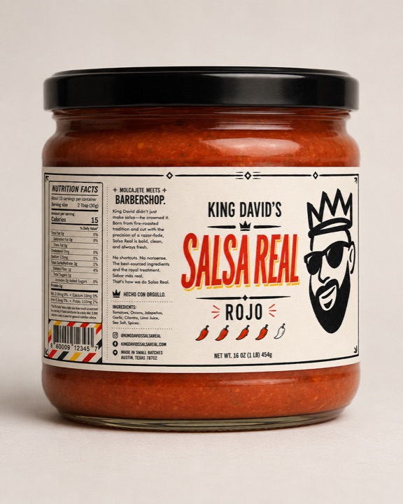
“Molcajete meets Barbershop.”
Situation
My barber has been cutting hair in Denton, Texas for over a decade and making salsa just as long — for his family, for years. He wanted to sell it. He had a recipe, a nickname, and a crown he’d been doodling since the margins of a high-school notebook. The brand came out of conversations in his chair, one haircut at a time.
Insight
The practiced hand is the brand. A barber refines the same gesture across ten thousand repetitions until the hand moves before the mind; the salsa was made the same way. Nothing had to be borrowed. His geography was the story — Guerrero, Chicago, Texas — his profession was the design philosophy, and the crown he’d drawn a thousand times was already the mark.
The moves
- Archetype: Creator, not Sovereign. The crown is a self-portrait — king of his own bench, not king of the realm — which is why it can carry an irreverent chisel-marker zigzag no royal brand would tolerate.
- “El Trazo,” the stroke that knows itself: a design philosophy with one rule — outline for what is, solid fill for what insists. Two values, ink and warm paper. Off-center, always, because a centered mark is a logo and a mark where the hand fell is a signature.
- A bilingual voice that never translates itself. “Real Ingredients. Sabor Más Real.” No italics on the Spanish, no parentheses, no “authentic” doing apologetic work.
- “Made in Texas. Roots in Guerrero. Sharpened in Chicago.” — sharpened doing triple duty (a razor, a knife, a skill), and used sparingly so it keeps its surprise.
- Four message pillars every line ladders to: real over fancy; pride without permission; made by hand, marked by hand; family table, not gourmet shelf.
Shipped
Brand brief and foundation, the King mark and the Crown, the wordmark, locked Rojo and Poblano labels, a 31-slide brand deck, and the storefront. The founder’s review of the presentation: “It does feel like me.”
Built by hand
Every website, too.
- erickornacki.com Astro this site
- getsolaris.ai Next.js marketing site + client portal
- Salsa Real storefront Next.js · Shopify headless launching 2026
- switchcare.com WordPress rebrand + SEO/AEO program
- revision.coop nonprofit site